Export & Count Jira Plugin
Export & Count Jira Plugin
Reimaging Count Experience for Jira Instance Users
Reimaging Count Experience for Jira Instance Users
EXECUTIVE SUMMARY
EXECUTIVE SUMMARY
I led the UX research and strategy for improving navigation and usability on the Export and Count Plugin. I reduced the number of steps users had to take to access key project details, export, and clone projects.
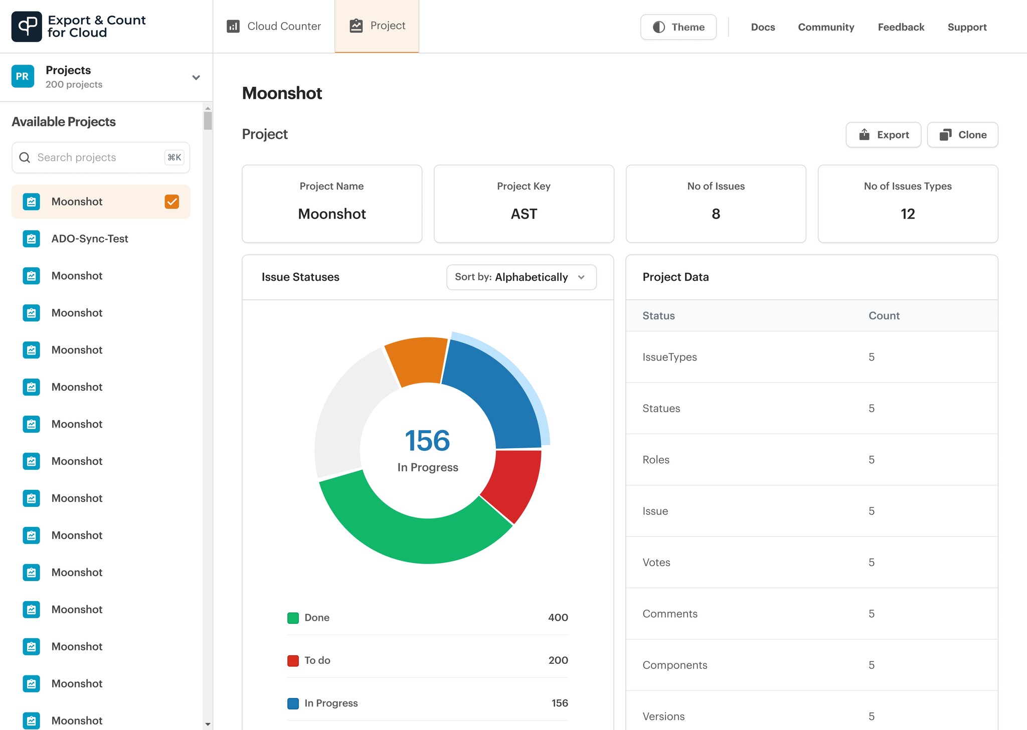
I also redesigned the project view, as it is the most important information users see when they open the project screen.
I led the UX research and strategy for improving navigation and usability on the Export and Count Plugin. I reduced the number of steps users had to take to access key project details, export, and clone projects.
I also redesigned the project view, as it is the most important information users see when they open the project screen.
YEAR
YEAR
2025
2025
2025
TIMELINE
TIMELINE
1 Month
1 Month
1 Month
ROLE
ROLE
Design lead
Design lead
Design lead
SKILLS
SKILLS
Product design
Stakeholder management
Interactive prototyping
User research & testing
Product design
Stakeholder management
Interactive prototyping
User research & testing
Product design
Stakeholder management
Interactive prototyping
User research & testing
INDUSTRY
INDUSTRY
ITSM
Enterprise SaaS
Software Development / DevOps
ITSM
Enterprise SaaS
Software Development / DevOps
ITSM
Enterprise SaaS
Software Development / DevOps
TEAM
TEAM
Yemisi Adeolowo, Simi Ojo, Ridwan Alade, Moshood Azeez, Abdulqudus Oladega, Yusuf Lawal, Boluwatife Omirinde.
Yemisi Adeolowo, Simi Ojo, Ridwan Alade, Moshood Azeez, Abdulqudus Oladega, Yusuf Lawal, Boluwatife Omirinde.
Yemisi Adeolowo, Simi Ojo, Ridwan Alade, Moshood Azeez, Abdulqudus Oladega, Yusuf Lawal, Boluwatife Omirinde.
UNDERSTANDING THE PROBLEM SPACE
UNDERSTANDING THE PROBLEM SPACE
Low conversion and poor usability signaled
Low conversion and poor usability signaled the need
Low conversion and poor usability signaled the need for a complete
the need for a complete redesign of the Jira plugin.
for a complete
redesign of the Jira plugin.
redesign of the Jira plugin.
When I first joined the team, they had an existing product: a Jira plugin designed to help Project Managers and Scrum Masters conduct site counts in their Jira workspaces. However, the team expressed the need for a redesign, as the current design lacked consistency and was not accessible.
They also noted that the plugin did not efficiently convey its value proposition, leading to low conversion. As the Product Design Lead, I was responsible for the end-to-end design strategy, improving internal processes, and testing the new proposed design.

THE NEED FOR CHANGE
THE NEED FOR CHANGE
Challenging stakeholder assumptions,
Challenging stakeholder assumptions, I uncovered
Challenging stakeholder assumptions, I uncovered key
I uncovered key usability gaps that aligned the team around a user-centered redesign.
key usability gaps that aligned the team around a user-centered redesign.
usability gaps that aligned the team around a user-centered redesign.
At the time I joined the team, the stakeholders believed that the plugin's existing design was “good enough.” To them, it had always functioned, and there was no need to fix what wasn't broken.
The team, however, felt otherwise. They had started noticing growing friction points, confusing flows, and outdated designs. Despite raising these concerns, their calls for a redesign and the need for user research were continuously brushed aside. It was difficult to challenge this without tangible proof.
That’s when they decided to bring in an expert, me. My role wasn’t just to redesign the interface, but to guide the team through the "why" behind every design decision, to identify where the designs fell short, and to uncover the usability gaps.
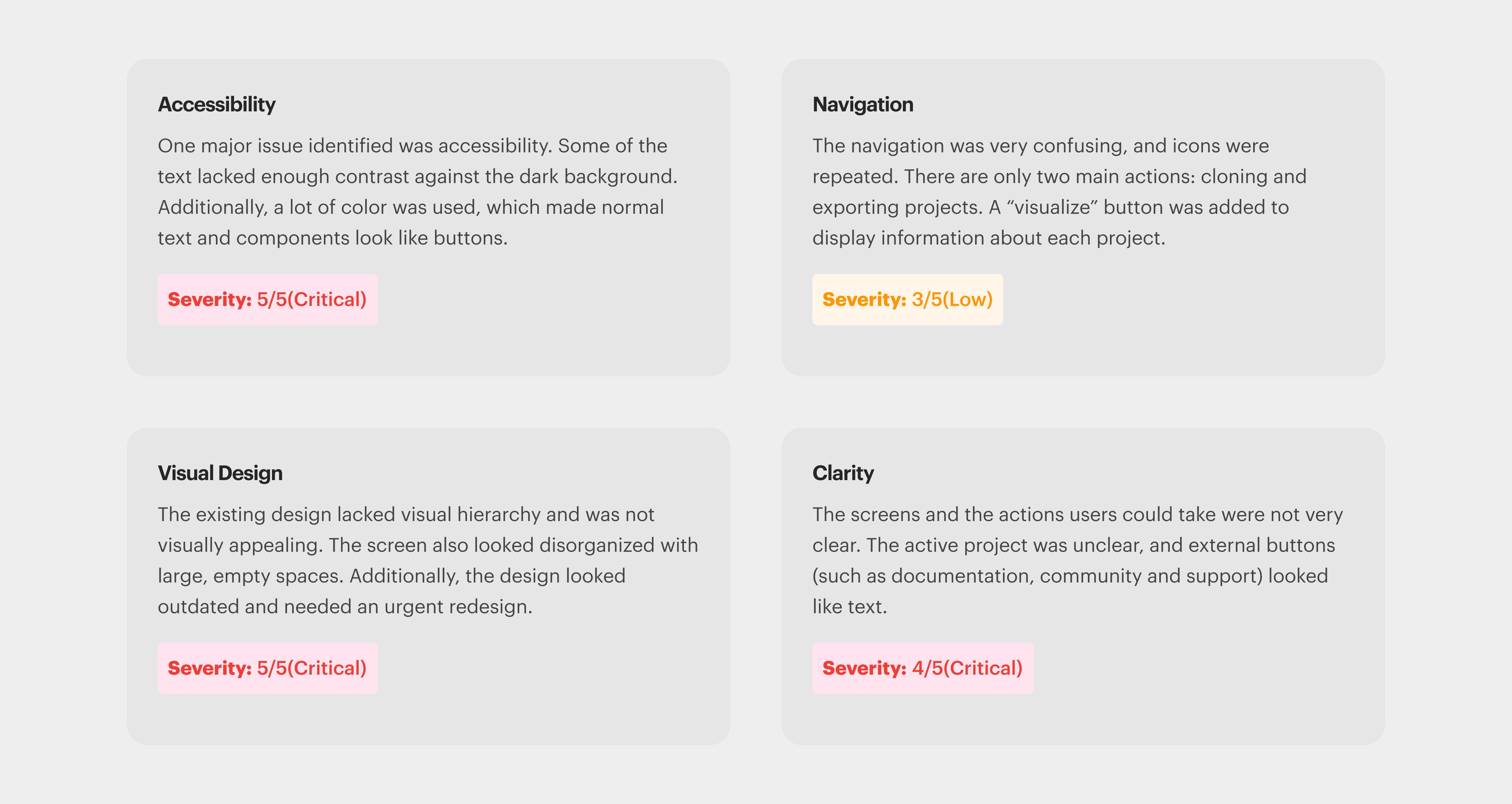
ANALYZING THE EXISTING SYSTEM
ANALYZING THE EXISTING SYSTEM
A structured audit revealed critical flaws
A structured audit revealed critical flaws across accessibility, navigation,
across accessibility, navigation, clarity,
and visual design.
critical flaws across accessibility, navigation, clarity, and visual design.
clarity, and visual design.
I conducted several meetings with the stakeholders and teammates to understand the plugin’s function and operations. This helped me gain an in-depth understanding of the plugin's value proposition.
To identify the friction points and challenges, I led the team in conducting a comprehensive audit of the product, meticulously mapping out every screen and workflow. I opted for this approach due to the limited time and budget available, ensuring we could still gather valuable insights without compromising the project's timeline.
I conducted the audit based on four areas: Navigation, Visual design, Clarity, and Accessibility.
ITERATING TOWARDS A BETTER USER EXPERIENCE
ITERATING TOWARDS A BETTER USER EXPERIENCE
Iterations focused on making core features
Iterations focused on making core features clearer and
Iterations focused on making core features clearer and more
clearer and more prominent for both users and stakeholders.
more prominent for both users and stakeholders.
prominent for both users and stakeholders.
The initial design combined Site Count and Projects within the same interface. However, after internal reviews, the management and product owner felt that these key features were not distinct enough. Their feedback highlighted that Site Count and Projects seemed embedded within the UI rather than standing out as independent, primary functionalities.
Taking this into account, I explored multiple iterations to refine the layout. One of the key challenges was ensuring that these features were both visually prominent and seamlessly integrated into the user flow. In my iterations, I experimented with different placements and visual hierarchies. However, it still didn’t meet the stakeholders' expectations.
ITERATION 1
The Site Count was placed inside the available projects
1
ITERATION 2
The Site Count/Cloud Counter was placed in the navbar as a dropdown menu
2
ITERATION 3
The Site Count changed from a dropdown to a toggle in the third iteration
3
A REVAMPED DESIGN
A REVAMPED DESIGN
A minimalist, focused interface designed
A minimalist, focused interface designed to make
A minimalist, focused interface designed to make users feel
to make users feel confident and in control from the first glance.
tusers feel confident and in control from the first glance.
confident and in control from the first glance.
From the moment I started sketching the solution, I had only one goal in mind. The goal was to create a user-friendly design that allows users to see all the important information and features at a glance.
I wanted users to feel confident when using the plugin. That meant making critical information, such as site counts, available projects, and project details, immediately visible and easily accessible. At the same time, I didn’t want to overload the interface with too much.
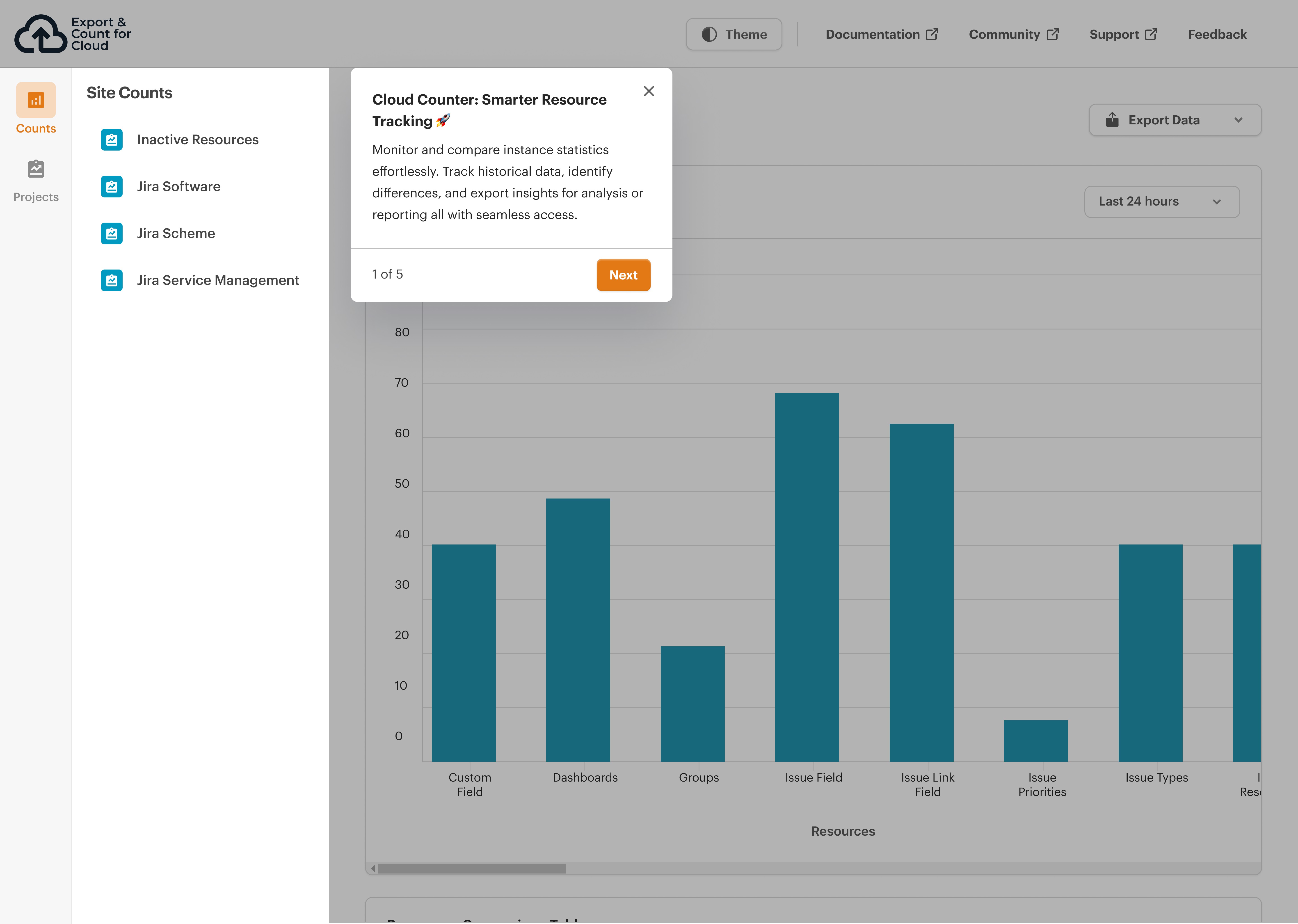
Interactive Welcome window
I designed a welcome window to communicate the redesign to users. This would provide a high-level overview of why we redesigned the plugin and what to expect. In addition, I designed a “tour guide” screen. The tour guide will efficiently onboard new users and introduce the new design to existing users.
Robust Exporting Options
I streamlined the export feature to make it more intuitive and user-friendly. This would allow users to export one or more projects easily. Users can export a single or multiple projects.
Robust Exporting Options
I streamlined the export feature to make it more intuitive and user-friendly. This would allow users to export one or more projects easily. Users can export a single or multiple projects.
Robust Exporting Options
I streamlined the export feature to make it more intuitive and user-friendly. This would allow users to export one or more projects easily. Users can export a single or multiple projects.
Smoother Cloning Experience
The initial flow was far from intuitive. I redesigned the “clone” feature simplifying the process and removing unnecessary friction. To enhance clarity, I introduced a progress loader that keeps users informed during the cloning process, along with a success modal that confirms completion.
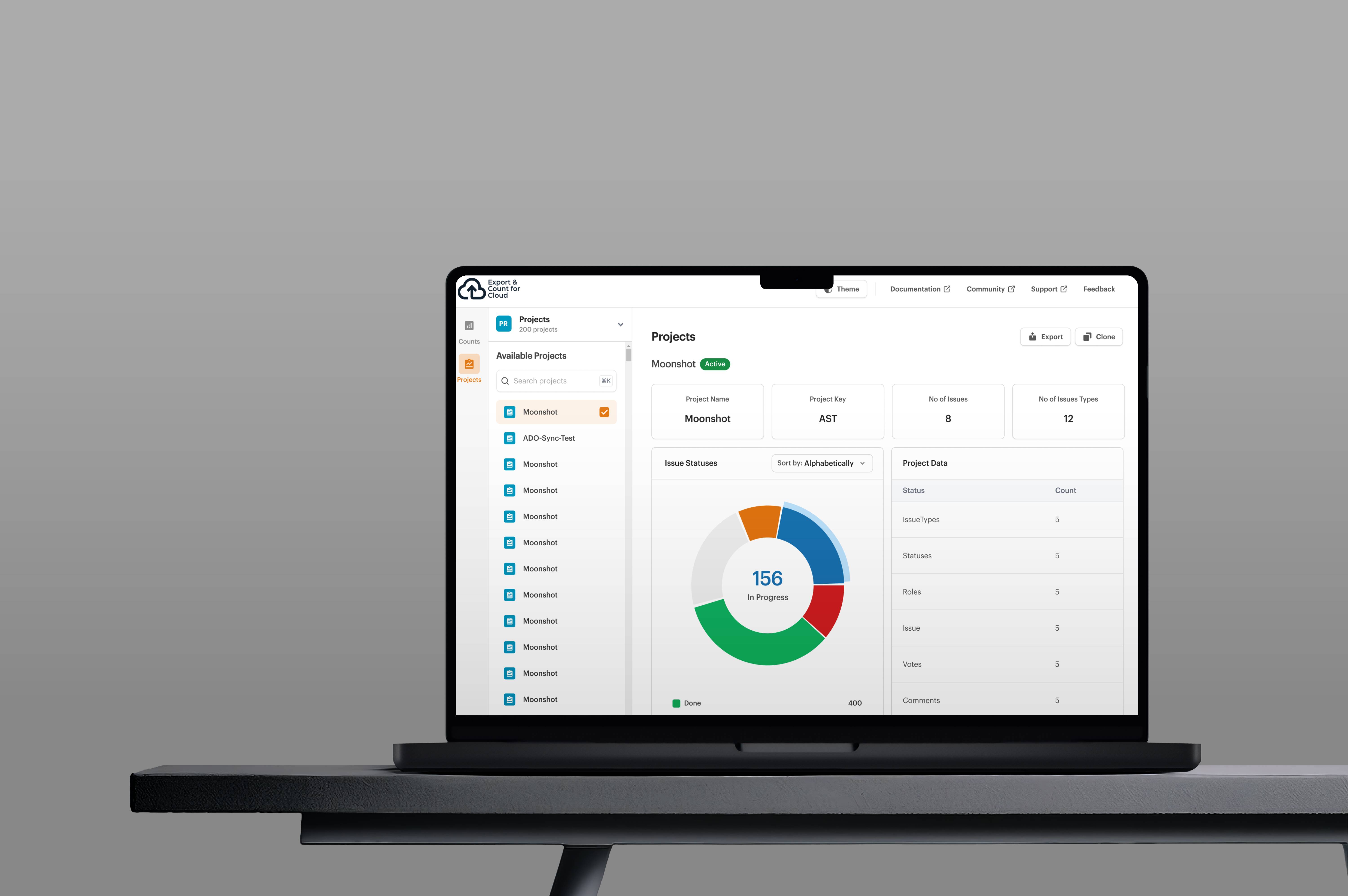
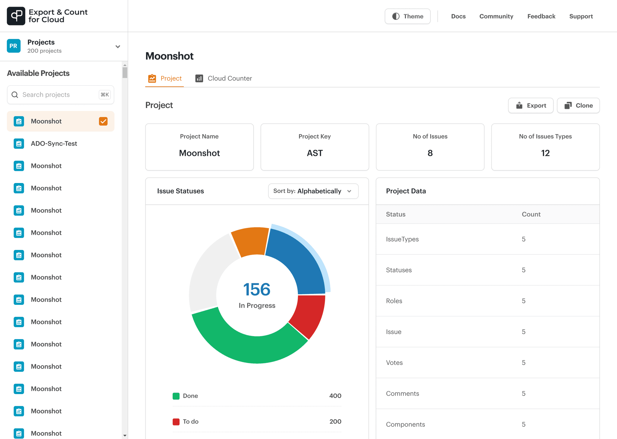
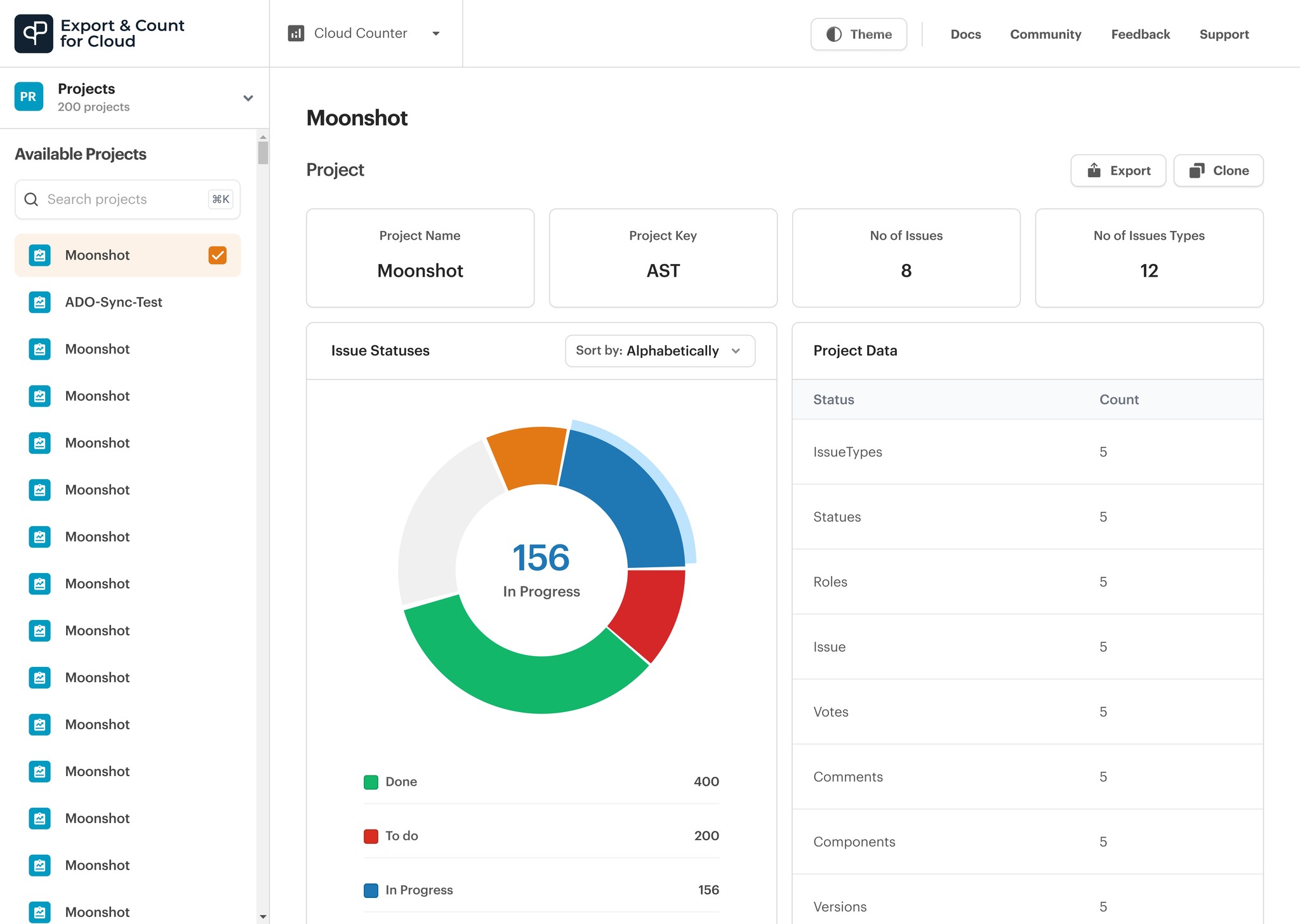
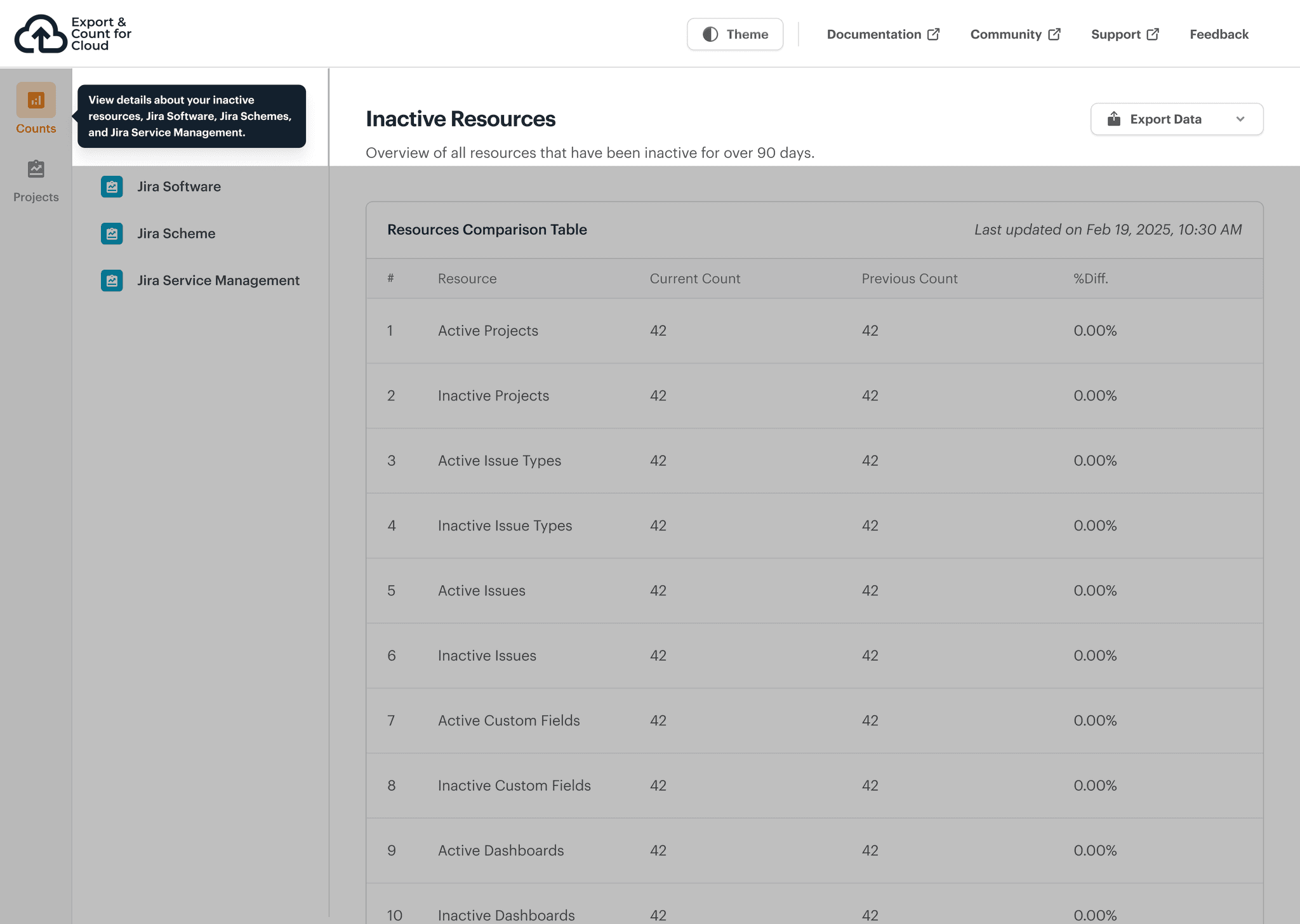
Redefining Site Count
Site Count give users a clear snapshot of their Jira environment, presenting insights about Jira Software, Jira Schemes, Service Management, Resource Comparison Tables, and Attachments. Users can export this data in various formats, such as CSV, PDF, or JSON, for easy reporting and analysis.
User Preference & Theme
To improve user experience and cater to individual preferences, I introduced both light and dark mode options. This not only enhances accessibility but also increases user engagement by giving users more control over their interface.
User Preference & Theme
To improve user experience and cater to individual preferences, I introduced both light and dark mode options. This not only enhances accessibility but also increases user engagement by giving users more control over their interface.
User Preference & Theme
To improve user experience and cater to individual preferences, I introduced both light and dark mode options. This not only enhances accessibility but also increases user engagement by giving users more control over their interface.
TESTING WITH USERS
TESTING WITH USERS
Usability testing revealed key friction points
Usability testing revealed key friction points in navigation
Usability testing revealed key friction points in navigation and task clarity
in navigation and task clarity, guiding final refinements.
and task clarity, guiding final refinements.
guiding final refinements.
To validate the clarity and effectiveness of our features, I conducted usability testing sessions with two internal users. Our goal was to assess how easily users could understand, navigate, and complete key tasks within the interface.
The sessions uncovered a few usability challenges, some related to navigation, others from possible confusion users might face when interacting with certain screens.

Problem
Usability testing revealed that non-technical users found terms like “Site Count” and certain page titles confusing.
Usability testing revealed that non-technical users found terms like “Site Count” and certain page titles confusing.
Solution
To maintain stakeholder-preferred terms while improving clarity, I added tooltips with plain-language explanations. I also included brief descriptions under each page title to help users quickly understand the purpose of each screen.
To maintain stakeholder-preferred terms while improving clarity, I added tooltips with plain-language explanations. I also included brief descriptions under each page title to help users quickly understand the purpose of each screen.

Problem
The content for the tour guide was not self-explanatory, confusing, and repetitive.
The content for the tour guide was not self-explanatory, confusing, and repetitive.
Solution
I worked with the content designers to rework the tour guide content to fit each screen.
I worked with the content designers to rework the tour guide content to fit each screen.
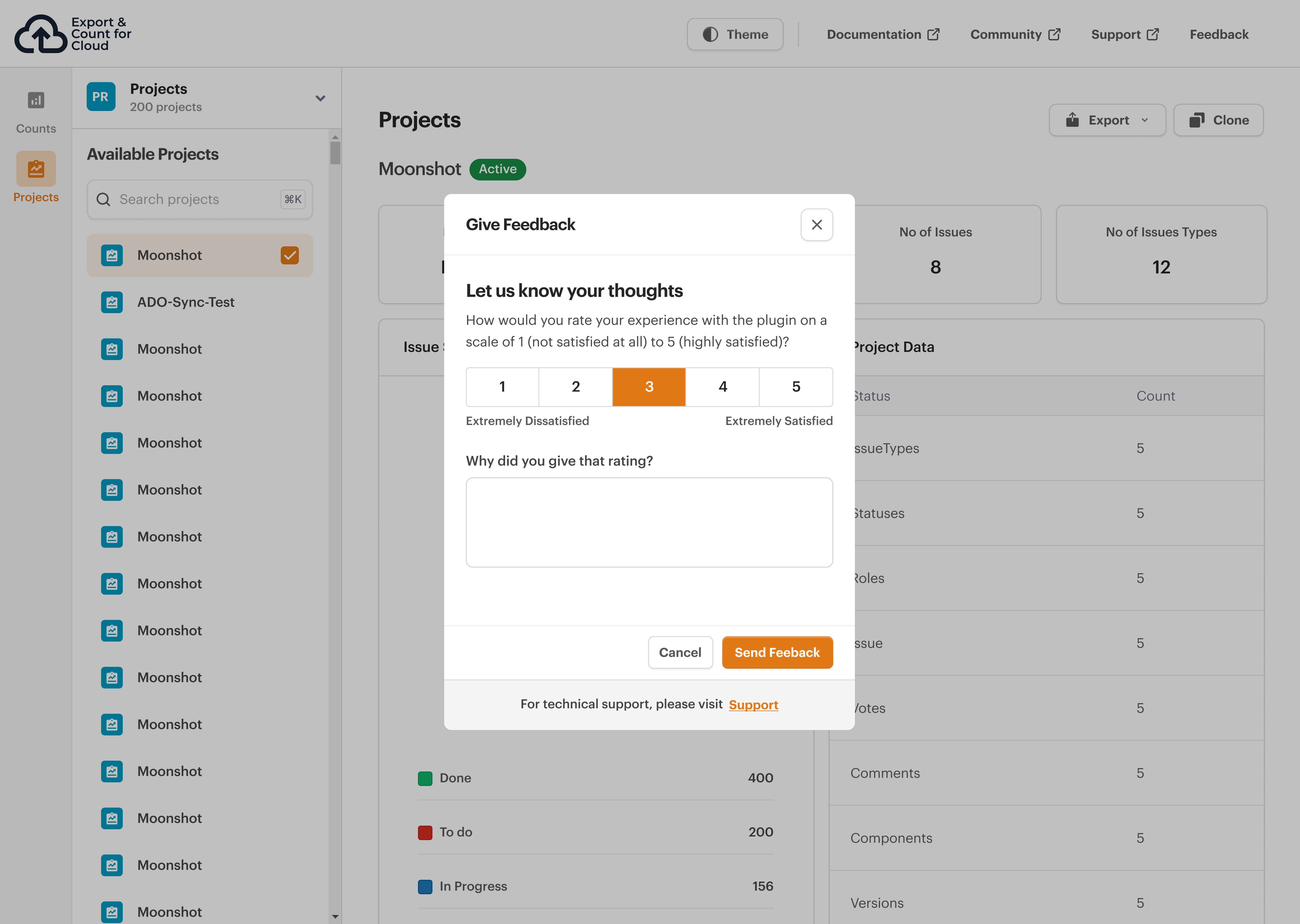
IN-APP USER FEEDBACK SURVEY
IN-APP USER FEEDBACK SURVEY
I designed a satisfaction survey
I designed a satisfaction survey tailored to the Atlassian
I designed a satisfaction survey
tailored to the Atlassian platform’s constraints.
platform’s constraints.
tailored to the Atlassian platform’s constraints.
To better understand how users felt about the redesigned interface, I created a satisfaction survey to gather feedback on their overall experience with the plugin. The survey allowed us to collect honest opinions and identify any areas for improvement. Given the architecture of the Atlassian platform, a satisfaction survey was the most effective and accessible way to capture user sentiment.
To better understand how users felt about the redesigned interface, I created a satisfaction survey to gather feedback on their overall experience with the plugin. The survey allowed us to collect honest opinions and identify any areas for improvement. Given the architecture of the Atlassian platform, a satisfaction survey was the most effective and accessible way to capture user sentiment.
To better understand how users felt about the redesigned interface, I created a satisfaction survey to gather feedback on their overall experience with the plugin. The survey allowed us to collect honest opinions and identify any areas for improvement. Given the architecture of the Atlassian platform, a satisfaction survey was the most effective and accessible way to capture user sentiment.
MANAGEMENT FEEDBACK
MANAGEMENT FEEDBACK
Stakeholders praised the final experience for striking the perfect
balance between clarity, functionality
Stakeholders praised the final experience for striking the perfect balance
between clarity, functionality
Stakeholders praised the final experience for striking the perfect
balance between clarity, functionality
visual appeal.
and visual appeal.
and visual appeal.
"The design is absolutely lovely! It feels intuitive, well-structured, and highly presentable. Navigating through the interface is seamless, and everything is exactly where you'd expect it to be. Great work on making it both visually appealing and user-friendly!"
"The design is absolutely lovely! It feels intuitive, well-structured, and highly presentable. Navigating through the interface is seamless, and everything is exactly where you'd expect it to be. Great work on making it both visually appealing and user-friendly!"
"The design is absolutely lovely! It feels intuitive, well-structured, and highly presentable. Navigating through the interface is seamless, and everything is exactly where you'd expect it to be. Great work on making it both visually appealing and user-friendly!"
CO-FOUNDER, ALLUVUIM
CO-FOUNDER, ALLUVUIM
LEARNINGS & KEY TAKEAWAYS
LEARNINGS & KEY TAKEAWAYS
A reflection on navigating design
challenges, trade-offs and collaboration while bringing the Jira plugin to life.
A reflection on navigating design challenges, trade-offs and collaboration while bringing the Jira plugin to life.
A reflection on navigating design
challenges, trade-offs and collaboration while bringing the Jira plugin to life.
The Export and Count Plugin marked my first full journey designing and successfully launching a Jira plugin. This project became more than just a redesign; it was a learning process for me.
I learned how to navigate trade-offs better, make smart design decisions with limited resources, and collaborate closely with cross-functional teams.